

Wayfinding is the art and science of guiding individuals within a physical environment, extending beyond traditional signage. It involves environmental cues, including color, iconography, and, in unique cases, audio/visual elements, working together to create an engaging and seamless navigation experience. In our diverse world, it must be multilingual and incorporate universal symbols, emphasizing consistency in design for effective guidance. This International Wayfinding Month, we’re revisiting three projects that creatively leverage wayfinding to enhance the overall client experience.
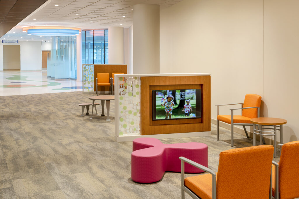
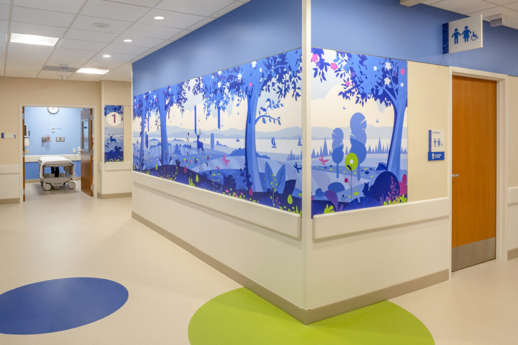
Storytelling at Children’s Wisconsin
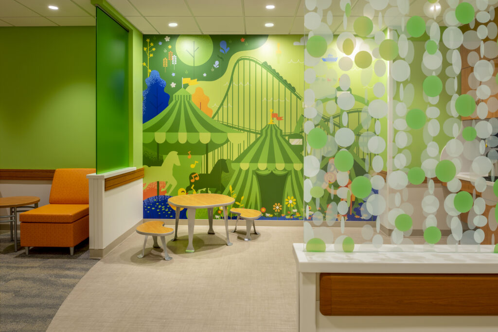
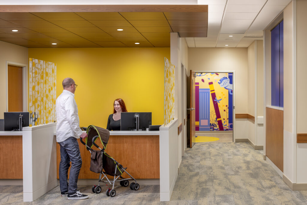
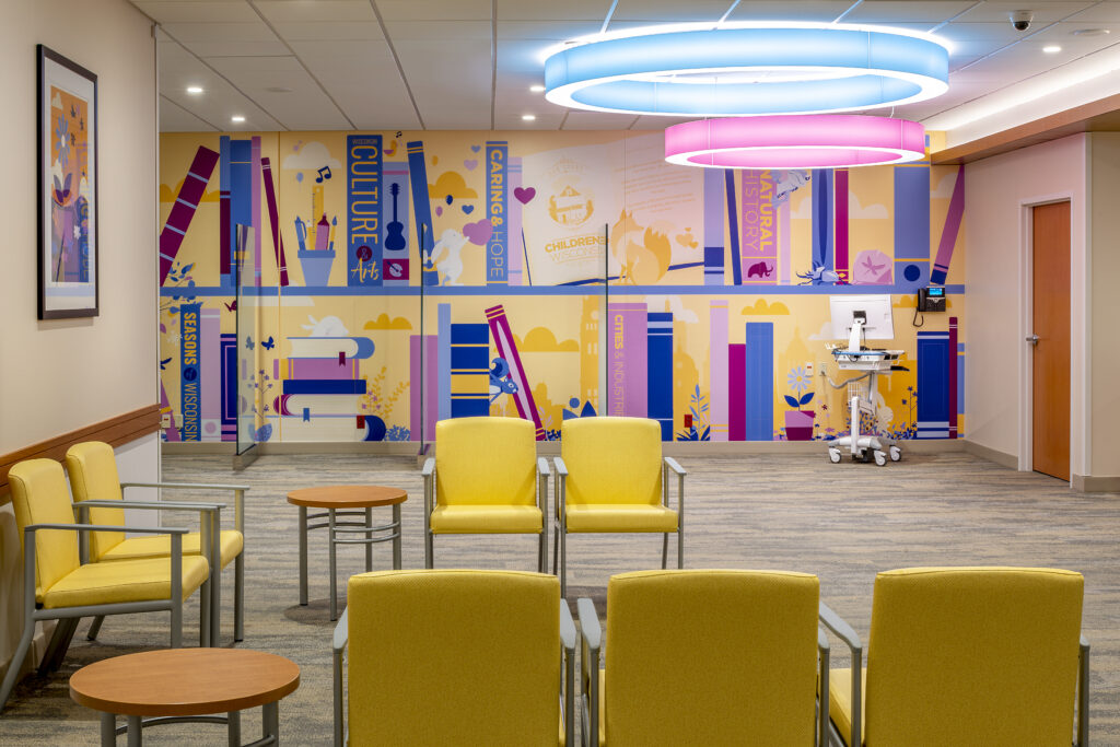
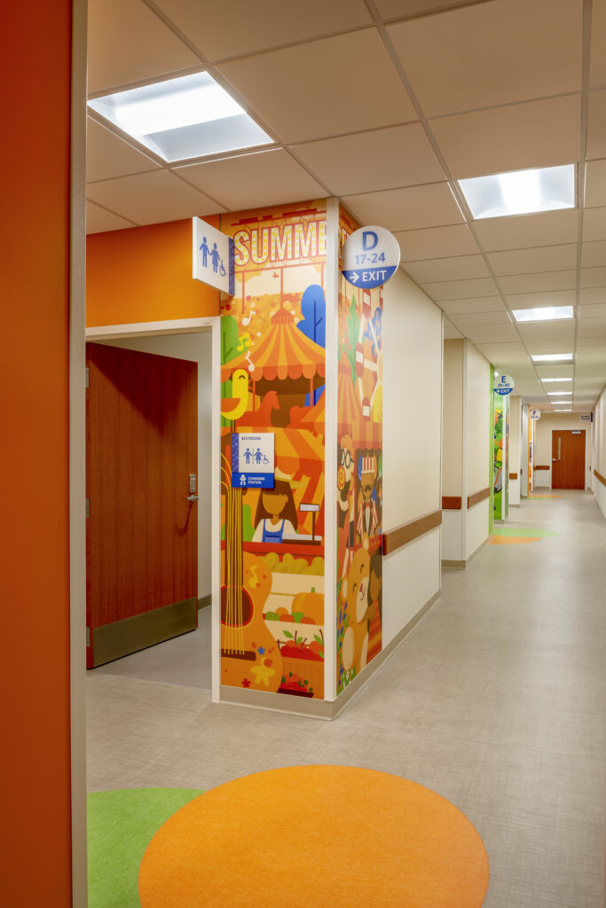
Storytelling was used at Children’s Wisconsin to create a cohesive and engaging experience for families and patients. Each floor is themed around different Wisconsin elements such as arts, entertainment, sports, technology, or agriculture, with graphics that reflect these themes. The images serve as visual cues that spark interest and reduce stress. By integrating these components, a typically long, white, and cold hallway is transformed into an interesting and engaging space, creating a seamless transition that provides a sense of comfort.
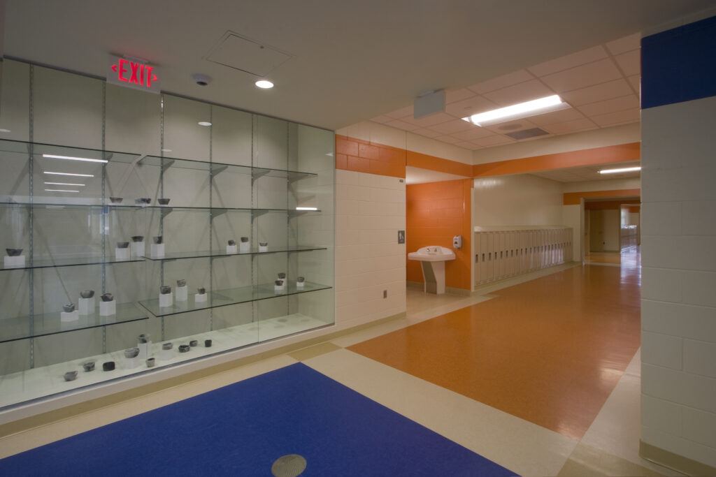
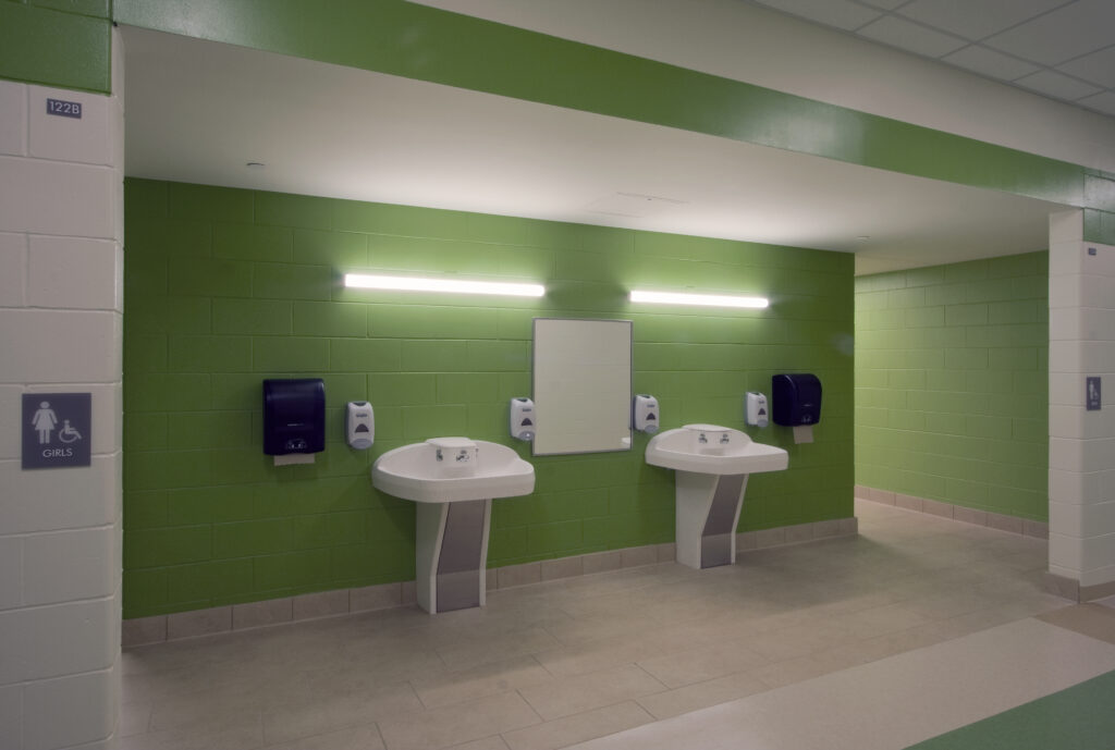
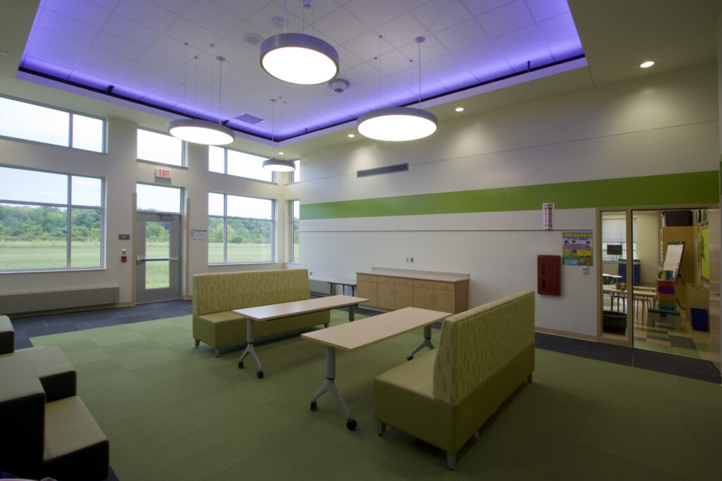
Utilizing Color at Olympia Brown Elementary School
At Olympia Brown, we used color to create a sense of neighborhood and belonging for students. Each wing is assigned a different color and pattern, corresponding to a specific grade level. This color-coded system helps students easily identify their designated areas and fosters organization within the school. Common areas such as the lobby, corridors, and library were given a neutral color, accented with the school color – blue. This strategic use of color aids in navigation, especially for elementary school children who may be unfamiliar with their surroundings.
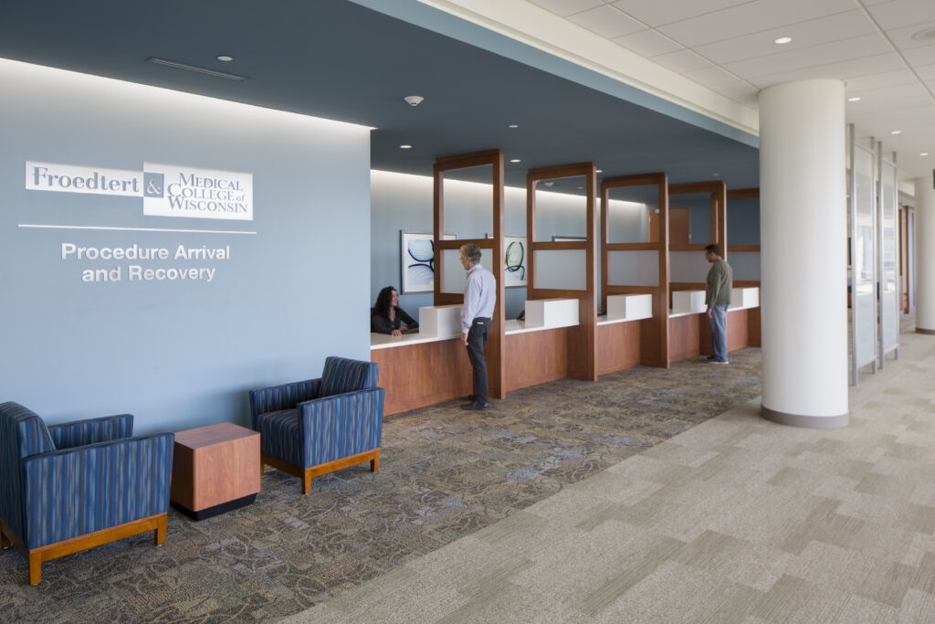
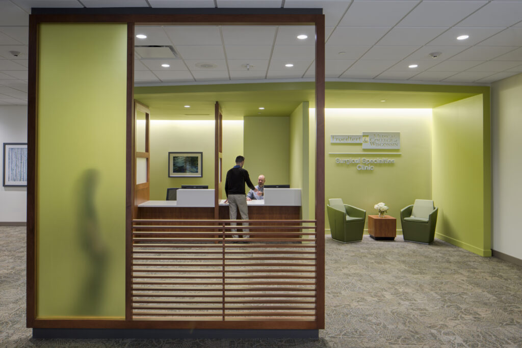
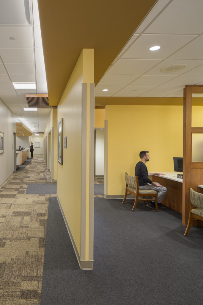
Audio/ Visual Elements at Froedtert
Poor wayfinding, especially in healthcare buildings, can cause stress for patients and their families dealing with emergency situations. To ensure this doesn’t affect their visitors, Froedtert implemented color-coding and visually distinct standards, such as using different colors and images in their parking structure, along with corresponding music on each floor. When visitors are leaving the hospital, the music paired with the visual helps aid recall of what floor they parked on. Inside the hospital, each floor is designated with a specific color to help patients and visitors identify what parts of the hospital they are currently in.
Wayfinding is a powerful tool that goes beyond traditional signage, incorporating environmental cues to create seamless navigation experiences. By incorporating messaging in multiple languages, universal symbols, and engaging elements like color, storytelling, and audio/visual elements, wayfinding enhances the overall client experience. Strategic use of these elements can foster organization, reduce physiological stress, and transform spaces to create meaningful connections with our surroundings.